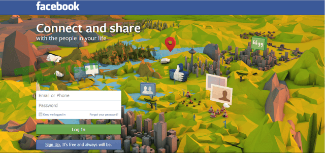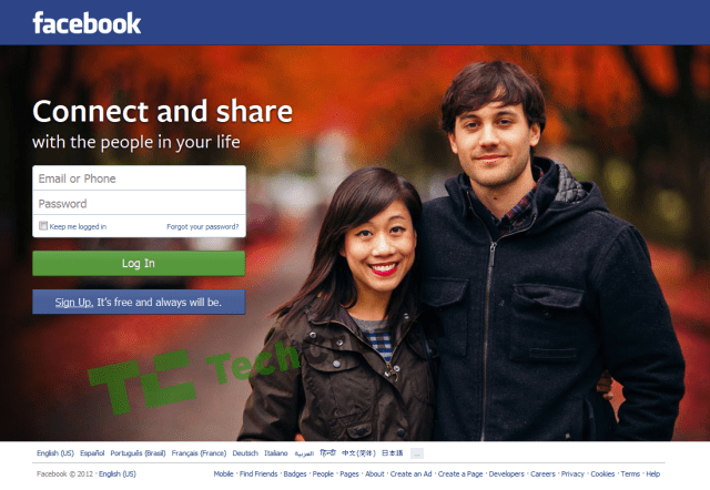
Facebook doesn’t want to look like just another website, so it’s testing colorful new versions of Facebook.com on a very small percentage of logged out visitors. One features a 3D polygon art map of the Facebook universe, while another showcases an adorable couple.
So next time you login, or finally surrender and sign up, you might be greeted with something a lot more vibrant than text inputs.

Facebook confirmed the images sent in by our awesome readers and watermarked by us are real but otherwise just gave the standard “we’re constantly testing new products and features across the site. We have nothing more to share at this time.” The data could prove that these designs confuse people are reduce or delay logins. That could lead get them scrapped, never to be seen again.
However, I’d expect Facebook will debut a more exciting log out page soon, maybe with a rotating set of photos and artwork that appeal to different demographics. For example, instead of the same photo of a couple for everyone, visitors might see photos of people from their country or part of the world.

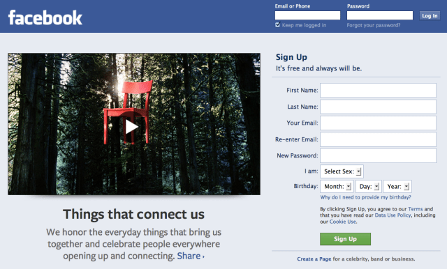
Along with the very small test of the polygon art, Facebook is showing some users a logged out home page with the “Chairs Are Like Facebook” brand video it released to commemorate reaching 1 billion users.
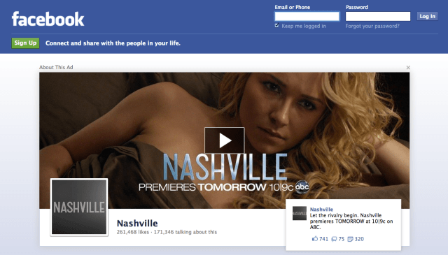
Facebook started jazzing up its logout page in February. It now frequently plasters the exit screen with big banner ads, some of which are interactive like a Bing search page or an in-line video seen below.

If push comes to shove with Wall Street, Facebook may end up putting ads on the logged out home page too. But that doesn’t give a very good impression to people it’s trying to convince to sign up or sign in more frequently. The polygon landscape dotted with Likes, chats, friends, and photos is much more inviting.
No comments:
Post a Comment